
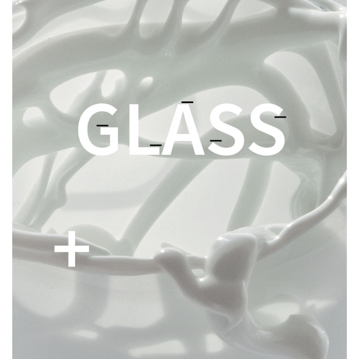
GLASS CATALOGUE


A CATALOGUE BUILT ON TYPOGRAPHIC DISCIPLINE, CONTROLLED LAYOUT,
AND A RESTRAINED VISUAL LANGUAGE. A STRUCTURE THAT ORGANIZES CONTENT
AND ALLOWS THE WORK TO REMAIN CENTRAL.
The catalogue was developed for glass works by Aleksandra Stencel and Patrik Illo, where light, material, and detail require a particularly sensitive approach to presentation.
The publication was conceived as a precise and controlled visual system, reducing formal gestures to
a minimum. The layout avoids unnecessary elements, focusing instead on clarity, proportion, and balance between image and typography.
A structured grid and restrained composition create a neutral framework for the works, allowing their material qualities to be perceived without visual interference.
The design approach emphasizes consistency and control — from the typographic system and page structure to the final print production — ensuring a coherent and refined editorial outcome.
OTHER Works

DESIGN CATALOGUE
Editorial catalogue design based on a modular layout and typographic discipline.

LEMON LAMP
Structure, geometry and recycled PET Felt in lighting form.

EXHIBITION VISUAL IDENTITY
Visual Identity System for the "Akord" Exhibition at Manufaktura Bolesławiec

NODE
NODE

NATIONAL MUSEUM IN KIELCE
Visual Communication and Spatial Coordination
REBRANDING HOTEL
VISUAL identity refresh based on the typographic heritage of Helvetica.
GLASS CATALOGUE
Exhibition catalogue design based on typographic precision and reduction of form.
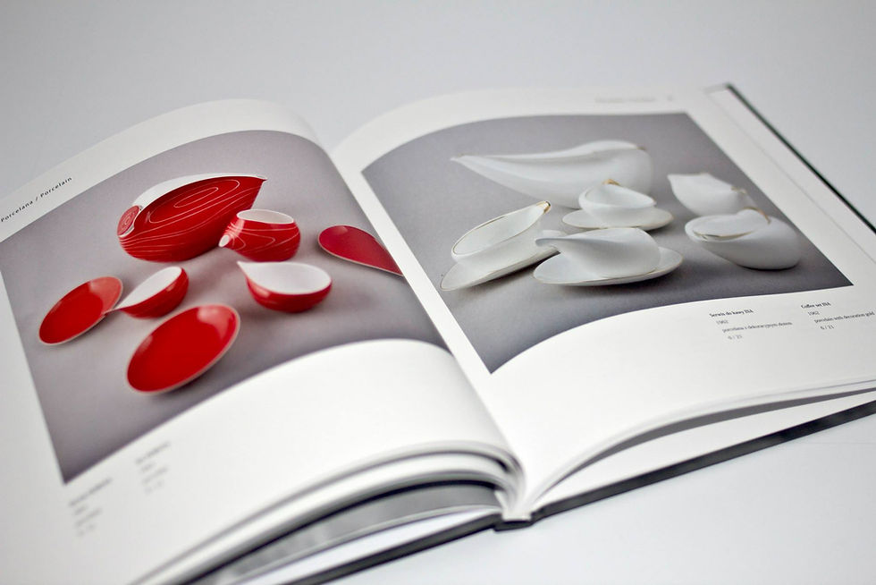
ARTIST CATALOGUE
Editorial design for a bilingual publication on sculpture, porcelain, and painting.

ACOUSTIC SOLUTIONS
BAFEO Acoustic Products

REBRANDING
REDEFINING BRAND IDENTITY THROUGH STRATEGIC DESIGN