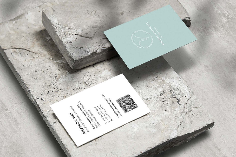
REBRANDING HOTEL


A REBRANDING PROJECT FOR A SWISS HOTEL NETWORK BUILT ON THE CLARITY, PRECISION, AND TYPOGRAPHIC CULTURE ASSOCIATED WITH SWISS DESIGN.
The project focused on redefining the visual communication of a Swiss hotel network through a contemporary interpretation of its existing identity, rooted in the typographic tradition of Helvetica. The aim was not to replace the brand language, but to refine and strengthen its visual coherence across printed communication.
The redesign included the development of a modular grid system for brochures presenting hotels located in Swiss cities such as Zurich, Zug, Basel, Geneva, and Vevey. The geometric structure of the publications was derived from a seal-like emblem used as a central visual element highlighting the key attributes of each hotel. Within this compositional frame, photography and information were organized to create a balanced and editorial narrative.
The project also involved the creation of scenarios for photographic sessions, collaboration with the photographer, and coordination of homestaging in selected hotel interiors. These activities ensured visual consistency between the architectural character of the spaces and the communication materials representing the brand.
The final outcome was a refined editorial system that combined typographic discipline with a structured visual framework, reinforcing the identity of the hotel network while allowing each location to retain its individual character.
Year: 2021
OTHER Works

DESIGN CATALOGUE
Editorial catalogue design based on a modular layout and typographic discipline.

LEMON LAMP
Structure, geometry and recycled PET Felt in lighting form.

EXHIBITION VISUAL IDENTITY
Visual Identity System for the "Akord" Exhibition at Manufaktura Bolesławiec

NODE
NODE

NATIONAL MUSEUM IN KIELCE
Visual Communication and Spatial Coordination
REBRANDING HOTEL
VISUAL identity refresh based on the typographic heritage of Helvetica.

GLASS CATALOGUE
Exhibition catalogue design based on typographic precision and reduction of form.
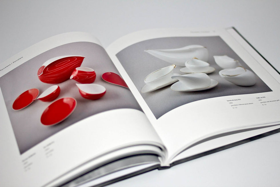
ARTIST CATALOGUE
Editorial design for a bilingual publication on sculpture, porcelain, and painting.

ACOUSTIC SOLUTIONS
BAFEO Acoustic Products

REBRANDING
REDEFINING BRAND IDENTITY THROUGH STRATEGIC DESIGN